Below is a non-exhaustive collection of logos and branding that are not featured on their own elsewhere (such as my work for the VACB).
Fields of Sinsinawa is new grassroots non-profit organization devoted to teaching and learning by farmers, for farmers, in the realm of sustainable agriculture, centered on a historic property in the southwest corner of Wisconsin. I was connected to this project as it is strongly driven by the Sinsinawa Dominicans, the congregation which sponsors the college where I was previously a faculty member. Always having been a fan of their social and environmental justice effots, the organizing committee was gung-ho, mission-driven, and a delight to work with. In addition to a few pieces of collateral, I also designed their website.
This logo, while representing aspects of farming from air to soil to water, takes some inspiration from the Sinsinawa Dominicans' logo in the arched forms.
A state conference on cyybersecurity, featuring a day dedicated to women in the field, provided a great opportunity to do some visual research to learn the imagery used in this region of the tech sphere. Horizontal and vertical layouts of a new logo with an email header and email signature graphic are shown below.


Having been a member and presenter for this local, volunteer-run professional development organization for several years, I've recently agreed to help lead and regain some interactivity lost during the early pandemic years. I've also hosted and designed a WordPress website and begun email marketing campaigns. In this design, I referenced pixels and the overlapping square icon which is used to represent various ways of combining vector shapes in Adobe software. This integrates both the two types of graphics files (pixel and vector) as well as the Adobe creative software focus into the brand for this welcoming group that is a combination of pros, students, instructors, and enthusiasts.
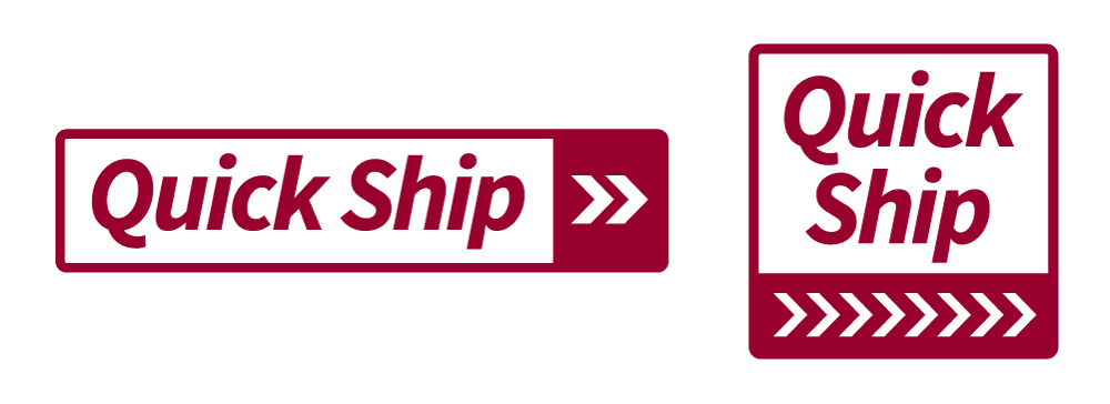
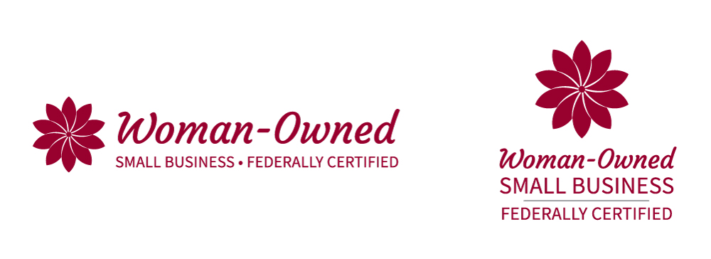
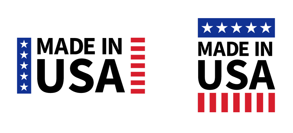
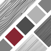
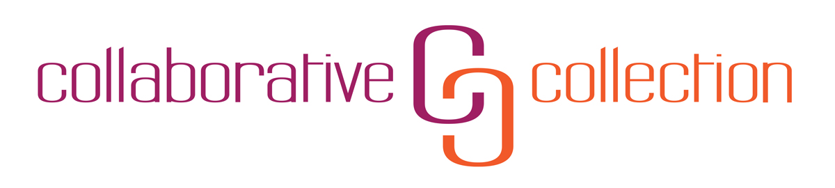
This client's savvy marketing team requested a custom set of logos to describe special features in their contract furniture business to enhance the look of their brand. Happy with the outcome, I was then enlisted to design evergreen icons for five categories of customization options on their website redesign project.
This logo is the result of working with a veterinary client with a keen eye for visual design. The client's "House Calls for Cats" business quickly grew to include more species, prompting a recent update to represent both pets and hobby farm animals. This logo is being used on business cards, clinic forms, and a website that I designed with WordPress.
My hometown holds a family-friendly New Year's Eve celebration each year, where local community groups create craft, food, and entertainment options before a replica of a local landmark is lowered at midnight. The Haines Shoe House sits not far from town, and has had a few purposes over the years, sitting by the highway and making visitors double-take, like any good quality American roadside attraction. The two place names include the town (Hallam) and the township (Hellam). It has been used in various mediums by the organizing committee.

As part of my freelance work for this division of Brodart, I created logos for lines of furniture featured in PDF and offset printed brochures.


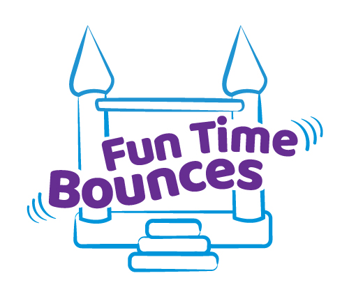
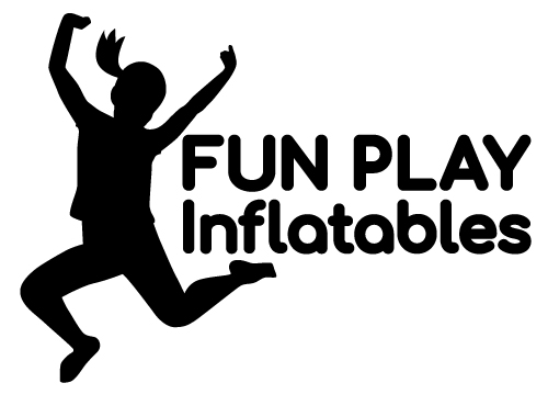
As part of my freelance work for the owner of these businesses, I produced logos based on their rough sketches/ideas and prepared them to work in a variety of formats from web to screen print.


Created as an employee of Impact Advertising, this was used by the manufactured housing and other truck-dependent industries in northern Pennsylvania in their campaign to stop the implementation of tolls on Route 80 in the commonwealth.
