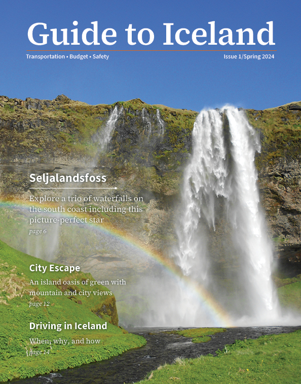
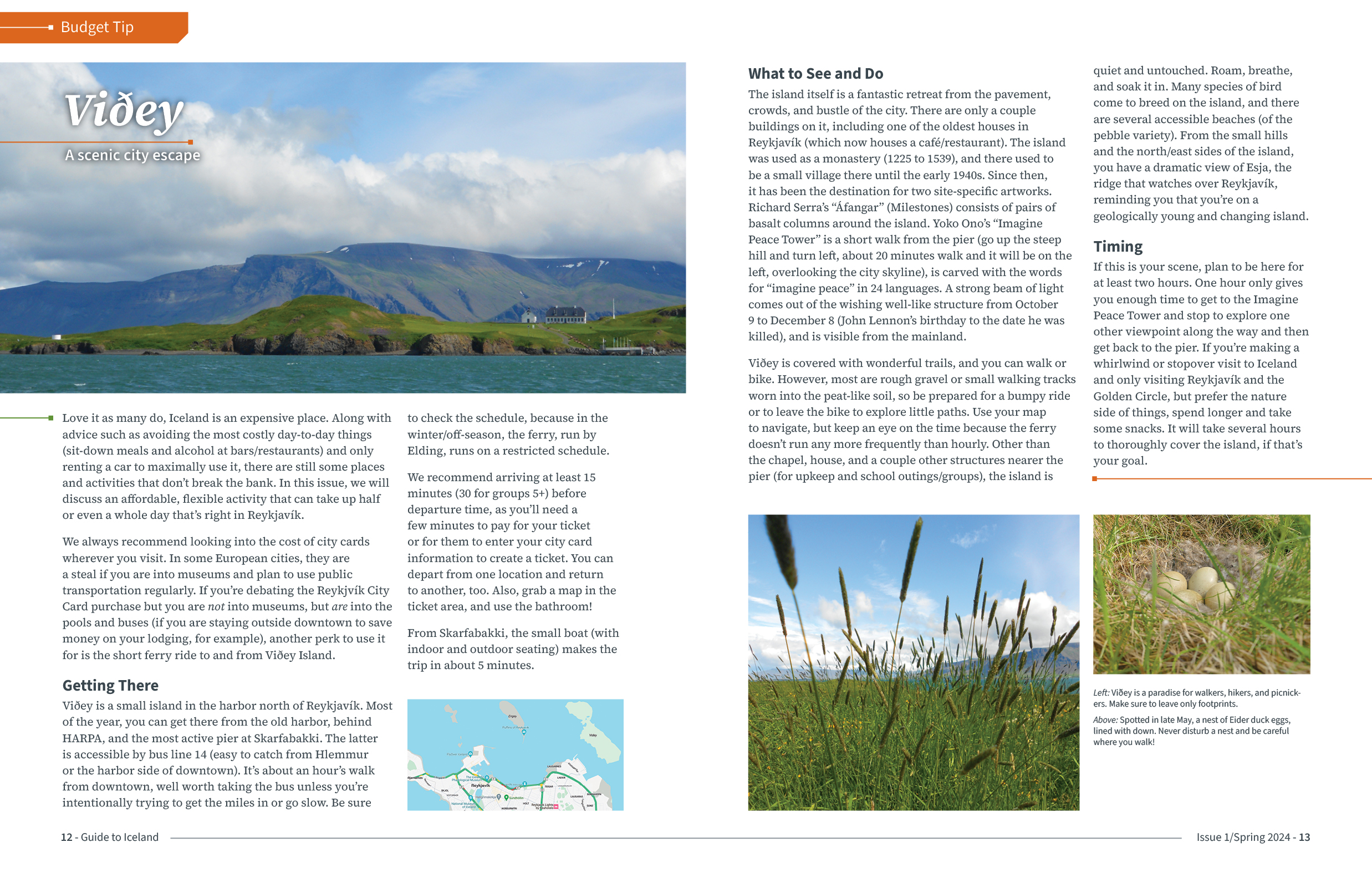
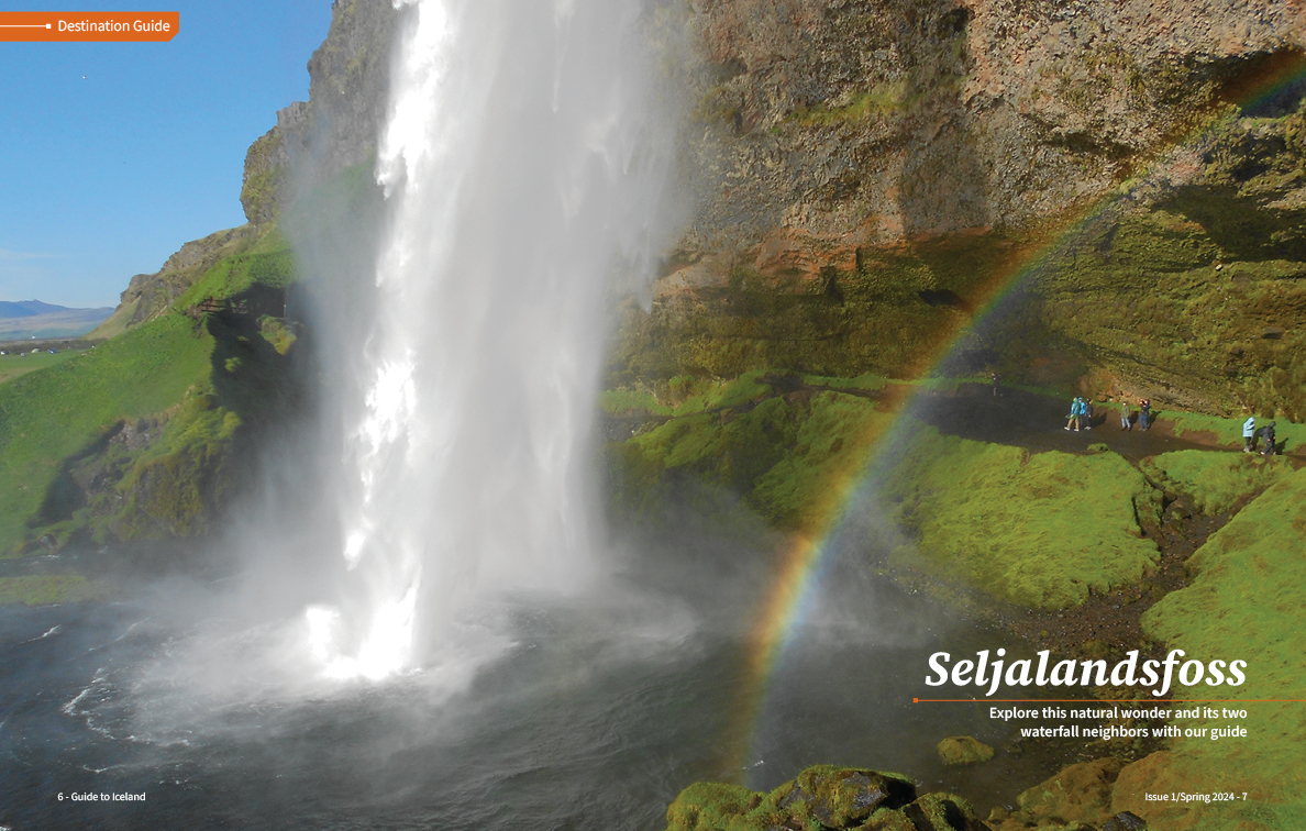
Having taught the concepts/skills and art-directed dozens of student multi-page layout projects, I created this 18-page mock print publication to demonstrate my own production without the restrictions and shared work of some older examples. When I learned WordPress, I produced several posts in order to understand the platform and have content to use, sharing travel knowledge and photographs of Iceland, where I have made several short and long stays. This blog has also come in handy to share with people who ask me for travel advice. Adapting some of that content and adding more photos, I developed this piece. In theory, this would be the front section to draw in tourists looking for practical information, and it would be followed by an advertising directory. The publication would be available for free in places tourists frequent (Icelandair airport gates, near the exit of the Keflavík airport, plane and seatback pockets, bus/coach hubs, food halls, etc.).
First, I created a version without a distinctive design, where I worked out space and layout plans, for proof of concept. Next, I developed a style guide (one page shown below). Finally, I applied the style guide to my rough version.

This document is fully designed for print publication at a typical magazine page size, cleanly and efficiently using paragraph and character styles, automatic page numbering, facing pages, swatches, margin and column settings, parent pages, bleeds, and full CMYK preparation.
View this publication on issuu.com (opens a new tab).
View the PDF of the style guide (opens a new tab).
I devised and pursued this partnership between the private four-year college where I was faculty and the local technical college. In managing this project, I worked with faculty and staff at both institutions, evaluated course equivalences, and produced this planner to guide students through the potential and the process.
The gradient on the cover moves from the blue of the technical college branding to the red of the four-year college, representing the student's journey of two years at each institution.
See the entire PDF here (note, this is under review for content updates).

This piece was made to stand out from the conservative, somewhat drab marketing pieces typically produced by the College at the time. I also produced one for each program, as well as versions that folded in half. This assortment allowed for flexible sizing to fit Admissions folders, different display areas, and use by other staff and faculty. It was designed to be printed as-needed on laser printers. The use of the College logo still follows brand guidelines.
I created an invitation to be shared electronically among the institution (and viewed on desktop computers) for the presentation of my sabbatical project. This one-hour lecture covered the travel, research, and motion graphics works that I produced about the similarities between the Northern Lights and my experience of synesthesia.
Of course, as with many events scheduled for March 2020, the event was rescheduled to April 2021 and held through video conferencing, with excellent attendance and questions.
The photograph and writing are also my own.

This project explores my synaesthetic connections between colours and personalities. During two months living in Belfast, as the international artist in residence at Digital Arts Studios, I collected symbols of the surrounding atmosphere, attitude, and history that stood out most. When drawing each of these things in Illustrator, based mostly on my own photos, I applied the colouring that most suited each item's reputation, history, and character by matching the personalities that I synaesthetically perceive when describing different hues. For the traditional instruments, I drew upon my synaesthetic perception of colour when hearing sound.
View this book on issuu.com (opens a new tab).


Part of the reason emoticons and emotibreviations have become so popular is that typed communications remove facial expressions, body language, and, most importantly, tone of voice from the message. In the convenience of text-only contact, we loose the human element. It leads to misunderstandings, hurt feelings, and rounds of clarification that could have been saved. Granted, it can come in handy to type out responses with the ability to so easily mask the nasty faces you're pulling or the droop of defeated shoulders. But what if there was a set of punctuation to describe the tone in which you would like the message to be read?


In honor of punctuation past and in anticipation of the future's glyphs, I share this set of doodles as a light-hearted rhetorical solution to getting the human element back into text communication. Many are based up on my synesthetic visual perception of concepts. For example, when I think about patience and acting with care, a solid near-perfect circle is paired with that concept as much as its language description. Like other types of synesthesia, these associations are automatic and consistent.
I created the font using Illustrator and FontLab Studio.
View this book on issuu.com (opens a new tab).