This project explores my synaesthetic connections between colours and personalities. During two months living in Belfast, as the international artist in residence at Digital Arts Studios, I collected symbols of the surrounding atmosphere, attitude, and history that stood out most. When drawing each of these things in Illustrator, based mostly on my own photos, I applied the colouring that most suited each item's reputation, history, and character by matching the personalities that I synaesthetically perceive when describing different hues. For the traditional instruments, I drew upon my synaesthetic perception of colour when hearing sound.
View this book on issuu.com (opens a new tab).


When I had recently joined the ranks of iPhone users, I found it interesting that the phone presents you with notifications where you must choose, rarely leaving you a "gray area." What if life did that? As this technology becomes more and more embedded in our lives, culture, and decisions, I'm basically just waiting for one of these to become real. Made in Photoshop (2012) and Illustrator (2015) with freely available iOS interface resources.
View the whole project here (opens a new tab).


Wassily Kandinsky (b. 1866, Russia; d. 1944, France) is widely believed by researchers to have been a synesthete. Among his writings, we have records of his thoughts on the relationship of multisensory connections in art. He presented and taught these concepts as fact during his career, demonstrating their absoluteness in his mind. In his 1912 text Concerning the Spiritual in Art, Kandinsky writes several pages filled with detailed attributes of personality and presence for several of the basic colors.
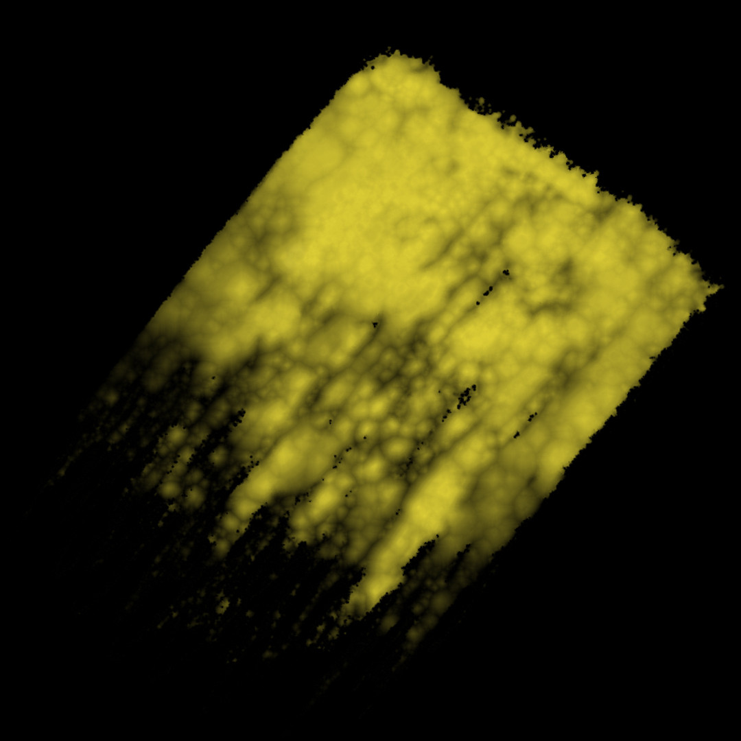
From this passage and several examples of his abstract artwork, I created a personality profile for each hue. I compared this to my own perceptions of the same type, noting similarities and differences. Then, I created two pieces of digital artwork for each color–one interpreting Kandinsky’s perceptions and style, and one representing my own. This short visual catalog of two synesthetic experiences shows both striking overlaps and disagreements, which are experiences well-known to synesthetes and researchers yet rarely studied outside grapheme-color and sound-color types.
The first image of each color is my interpretation of Kandinsky's writings in tribute to his distinct abstract style. The second is my own visual description of the color in my own imagery.
View the whole project here (opens a new tab).

Kandinsky wrote about Red, visually described above:
Medium Red
Lighter Reds
Colder Reds

My Thoughts on Red, visually described above:

Kandinsky wrote about Black, Gray, and White, visually described above:
Black
Gray
White

My Thoughts on Black, Gray, and White, visually described above:
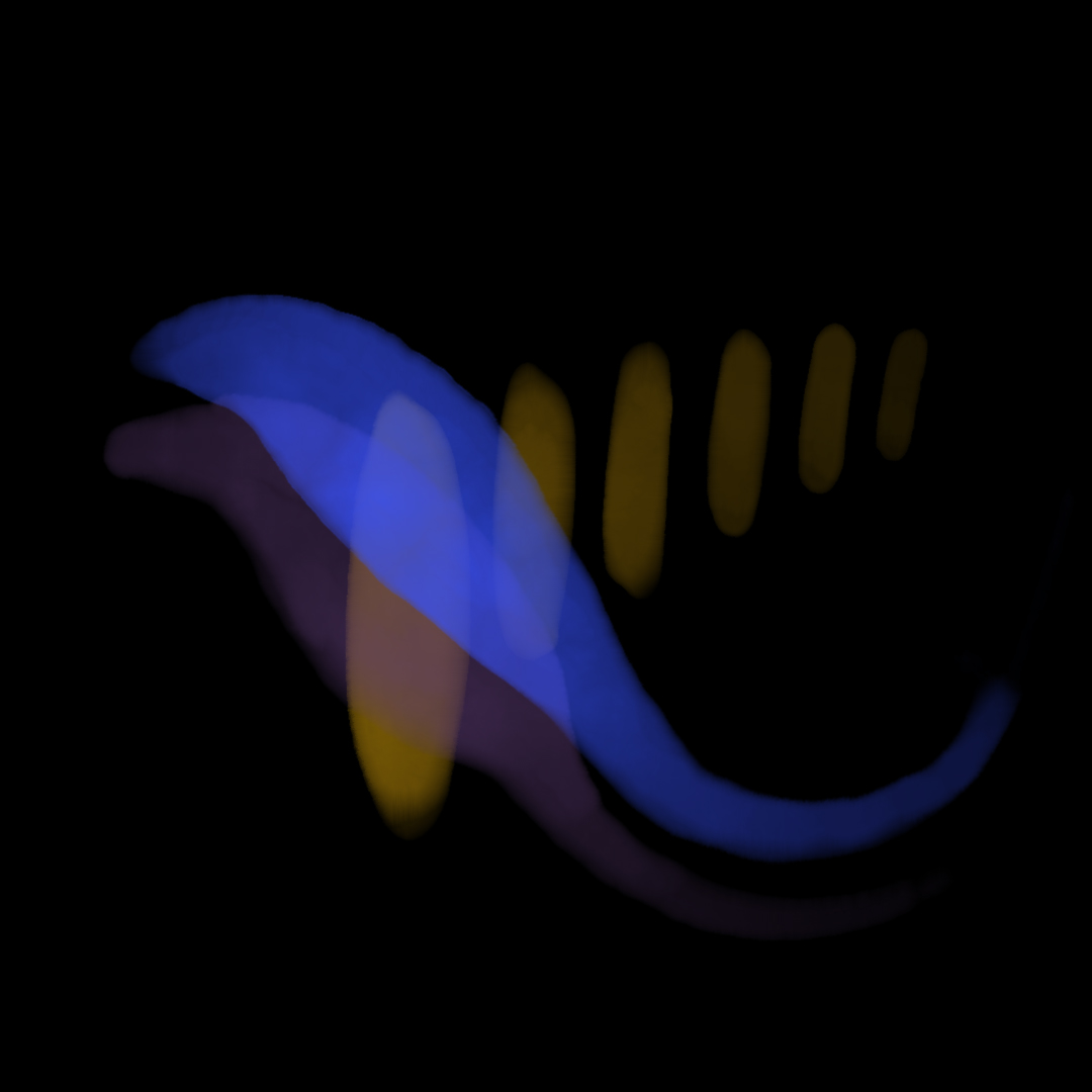
Inspired by a series of digital photographs that demonstrate the vibrance, delicacy, flow, and form constants of synesthetic photisms, these drawings are recordings of experienced mental imagery while listening to music. Created quickly on an iPad with an Apple Pencil and Adobe Fresco, and some with minor Photoshop for refinements.
View the whole project here (opens a new tab).


